Responsive web application
Digital Onboarding Platform
Project Duration – 18 weeks
My Role – Product Designer
OVERVIEW
The manual account opening process has alot of inefficiencies
Our era of information is characterized by the need to deliver services as quickly and efficiently as possible. When a customer wants to open an account, the traditional way is that he or she has to walk into a physical branch and fill out a number of forms before the account can be opened which usually takes 24 to 48 hours to activate the account.
There are a lot of issues and pain points associated with this, such as discomforts and drop-offs of users.
The Solution
Build a platform that automates the entire process
In this project, I collaborated closely with my digital design team members and other stakeholders across the organization to identify a solution to automate the entire account opening process by building a platform.
Together, we recognized that this solution came with its unique set of challenges that required careful consideration. In order to develop the platform, we collaborated to capture the manual account opening process. In order to enhance the overall customer experience, each step of the process was analyzed to determine which points could be automated and improved.
REVIEW
Analyzing each step of the traditional process
The steps involved in the manual account opening process;
- The customer visits a bank branch office.
- The customer completes a paper-based account opening form, which includes personal information and contact details.
- Supporting documents, such as identification and proof of address, may be required.
- A bank staff member reviews the application for accuracy and completeness.
- Upon successful verification, the account is created, and the customer receives account details.
- If there are any issues or missing information, the customer may be asked to provide additional details or documents to finalize the process.
RESEARCH
Competitor Analysis
Reviewing the onboarding processes for local and international digital platforms, we identified strengths to adopt and weaknesses to address.
A particularly interesting aspect of this phase of the project was getting to see firsthand the user experience from various platforms, in addition to testing out the onboarding of other platforms.
Approach
Landing Page
For easy navigation and great user experience, I designed the landing page with a minimalist design and a simple layout. A few interactive elements like hover states and tooltips were also added to enhance the user experience. To ensure that the landing page was intuitive and easy to use, I tested it with users.
Approach
User Input and Document Upload
We included a section for user input and document upload as part of the automation and improvement process. Customers can enter their personal information and upload documents such as identification cards and proofs of address.
Approach
Mobile Responsiveness
Since there are more than 60% of our target audience who are likely to access the platform through a mobile device, we made sure to optimize the design and the functionality of the platform for smaller screens.
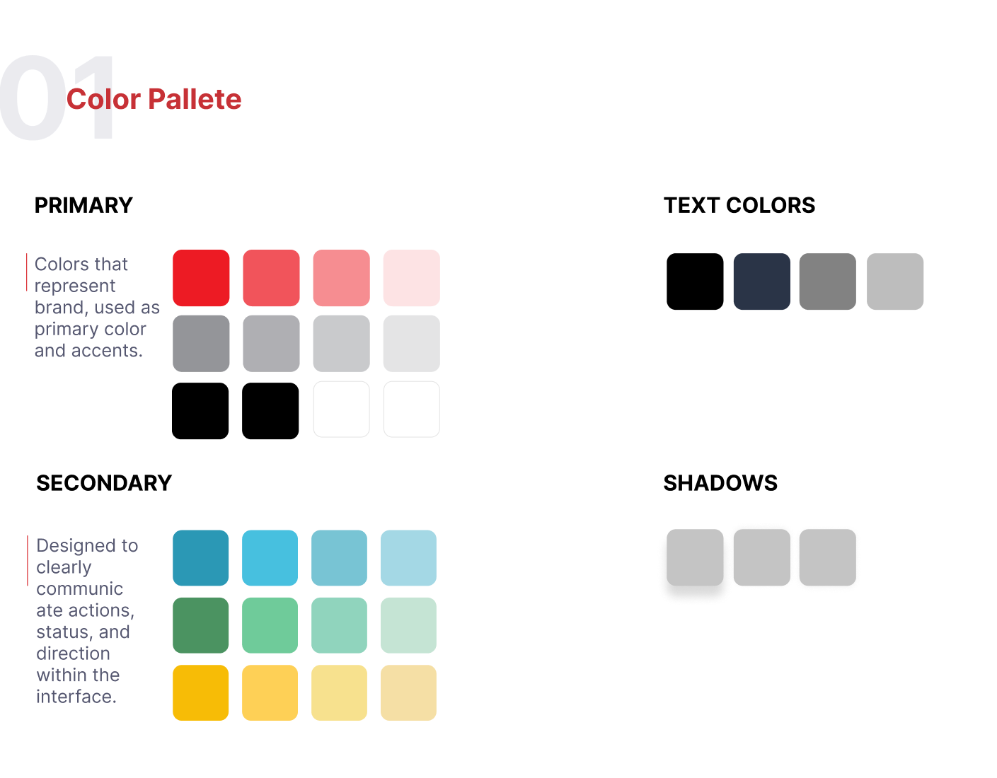
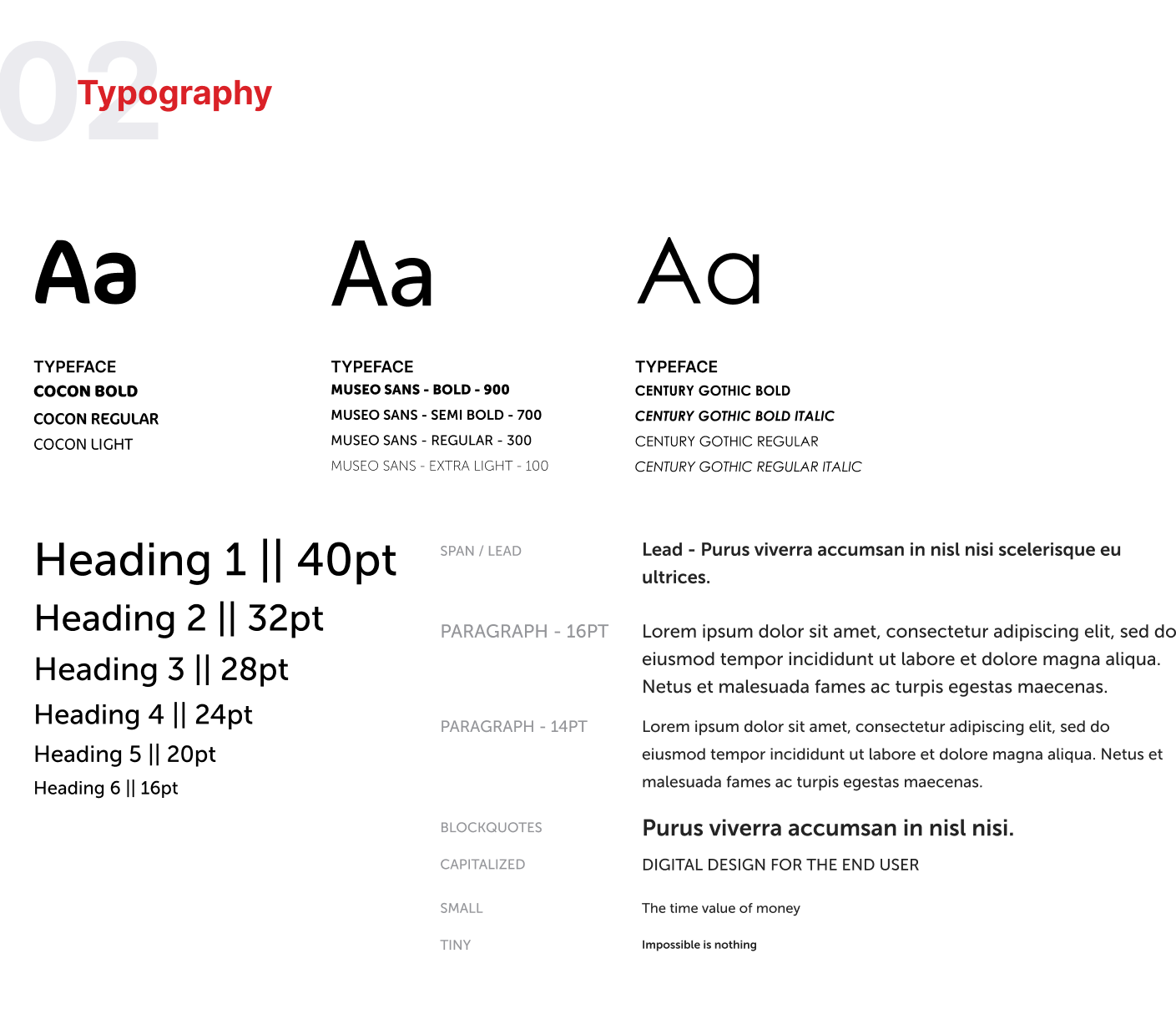
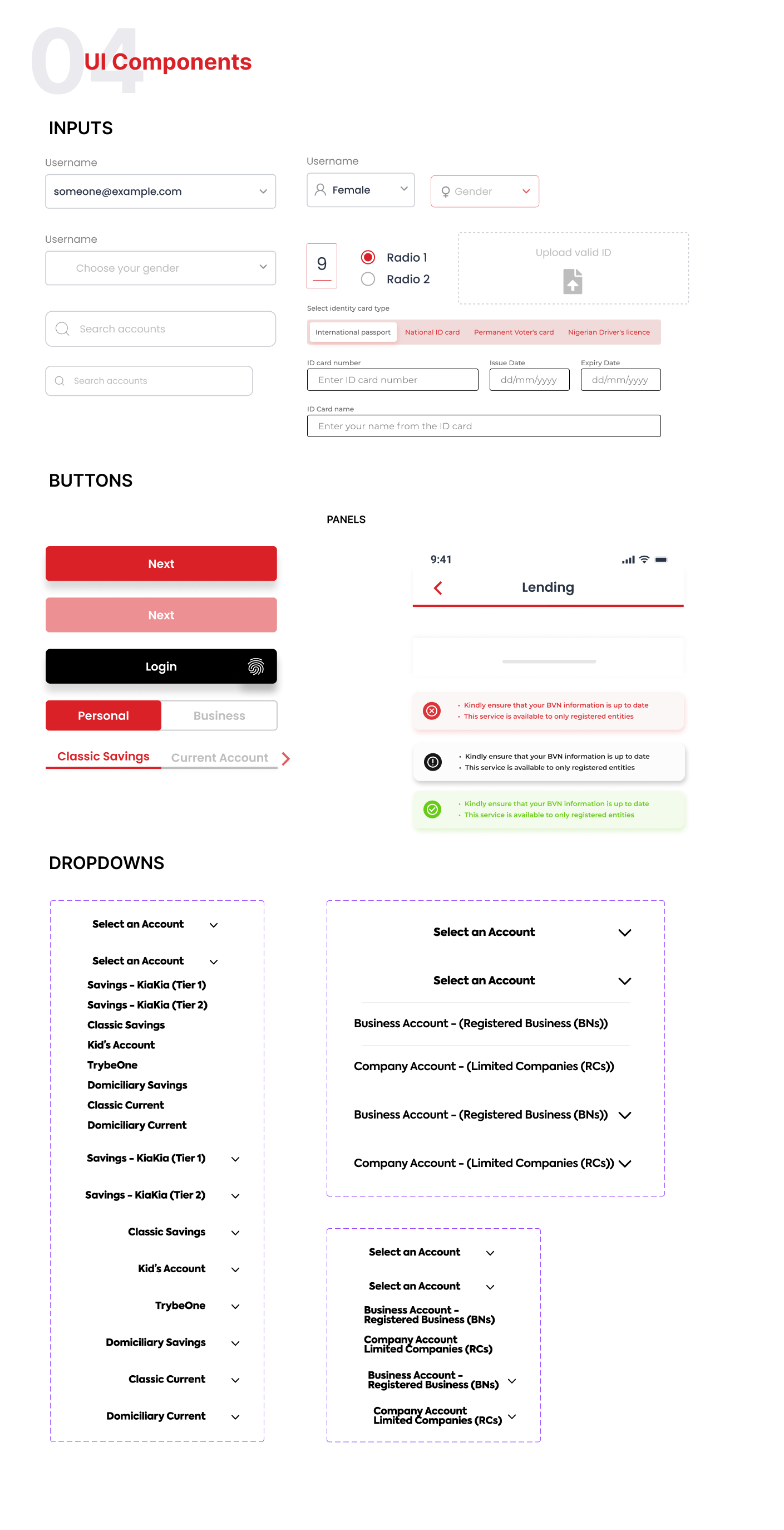
Crafting Consistency
Design System


Lessons Learnt
Key Takeaways
I learned that it is critical to identify user challenges, incorporate thoughtful prompts, and provide comprehensive information for seamless task completion. Without these elements, users are likely to become frustrated and abandon the task.
If I worked on a project like this again, I would focus on embracing scalability. This would enable seamless integration of additional features into the homepage. It helps unlock the potential for future enhancements, ensuring a dynamic and ever-evolving user experience.


